
My dad heads up a company called Able Governance, which helps other companies with their pension schemes or, uh, something. Regardless of the detail of what their offering actually involves, they wanted to make their website mobile friendly, and I was more than happy to help out.
Here I’ve detailed a selection of the changes I made to make it so.
Enhance!
First thing I did was stick in a viewport meta tag:
<meta name="viewport" content="width=device-width, initial-scale=1">
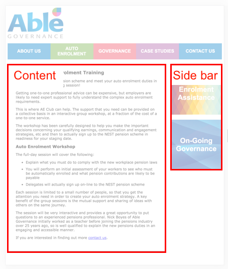
Before (squint):

After:

Although at first glance this does arguably look like a worse experience, the viewport meta tag is very useful for responsive sites. It saves the browser from having to guess at how wide to render the page, ensuring that it’s rendered for the device’s screen width, meaning that the text will be big enough to read.
As far as my understanding goes, this means that at page load (before any user-initiated zooming occurs), 1px on the site is equivalent to 1 pixel of the device’s screen (or whatever the devicePixelRatio is).
There’s plenty more info about viewport meta tags on MDN.
Fat stacks
Most of the pages of the site have a sidebar with some jazzy links to other relevant pages. With our limited space on mobile devices, we needed the body content to occupy the full page width, and so the best thing for these links was for them to stack at the bottom.
Before (scrolling over awkwardly):

After (scrolling down with a natural ease):

First thing was to remove the existing absolute positioning of the .content and .sidebar components and set them both to 100% width, so that by default they’d stack up one on top of the other.
Second was to restore the original layout on wider devices by floating the two left, and, within a min-width media query, setting their widths proportionally. I left room for a fixed-width margin by making use of calc().
.content {
   width: 100%;
   float: left;
}

.sidebar {
   width: 100%;
   float: left;
}

@media (min-width: 700px) {
   .content {
      width: calc(75% - 10px);
   }
   .sidebar {
      width: calc(25% - 10px);
      margin-left: 20px;
   }
}
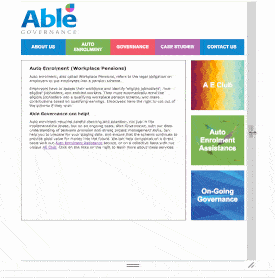
The result looks like this on desktop:
And this on mobile:

And this on both (bonus gif):
Hooray.
Navelucidation
So the existing navigation works great on desktop. It’s your pretty standard styled list of links, some of which have submenus with additional links that reveal themselves on hover.
However, mobile users would find it wanting. To maintain the side-by-side positioning on a smaller screen you’re faced with a choice of horizontal scrolling or squished up boxes that don’t fit the link text in and are hard to press (certainly with my big chunky gamecube-reared thumbs).

Additionally, the lack of hover state on a touch device meant that, to mobile users, the submenu links were inaccessible.
So, I did a quick google for mobile navigation patterns and found one that would solve these problems (and that I fancied implementing).
Step 1 - mobile first
First I set up the list of top-level-menu links and styled it up similarly to the existing menu, the main exception being that each link would stack vertically and occupy 100% of the page width.

Step 2 - digging deep
I set up the sub nav in a similar way, except within the main links. I made an open/close toggle button that would change the height property of the top level link, effectively hiding and showing the submenu.

The animation is important, as it subtly provides valuable information for the user about where parts of the page have moved to, avoiding the jarring effect that can occur when elements snap instantly into different positions.
Upsettingly, transitioning from fixed height to auto height doesn’t work with CSS transitions, so for a neat animation, you need to know exactly how high the menu should change to on expand. This isn’t an insurmountable problem however, as we can work it out with a bit of javascript.
Step 3 - the big reveal
To save valuable mobile-device screen real estate, I collapsed the menu into an all-consuming ‘menu’ item, having it closed by default. It was also important to animate this open and closed, which meant a bit more height querying, but this is no big deal. The menu is closed by default, meaning the user has to do less scrolling before getting to the content.

Step 4 - you are here
I don’t think navigation tools are all that useful if they can’t tell you where you are in addition to where you can go. I made it so that on page load, the current menu item is highlighted to waypoint the current page, and, by necessity, that if the current page is within a submenu, that submenu is expanded on page load.

Show me the codez
Here’s the code and a demo of the nav in a nice neat jsbin: http://jsbin.com/nidiyay/edit?html,css,js,output
That’ll do it
As always, there are still improvements that can be made, but for the interim I’m pretty pleased with it! Check it out on your own mobile-or-otherwise device at able-governance.co.uk, and, if you fancy it, maybe put in a query for pension scheme advice or something while you’re there.